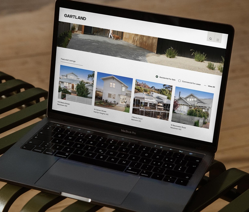
Gartland
A calm breath of fresh air through timeless design for these Geelong pacesetters.
Challenge
Born in 1999, Gartland has become one of Geelong’s top real estate agencies, specialising in both commercial and residential property. In the last few years, they’ve watched their city boom in population, business and size, as first home buyers and Melbournians realise the potential of the area. Geelong continues to modernise and gentrify, and Gartland came to us looking for a brand that would match this landscape. The brand needed to not only exude modernity, simplicity and stylishness, but also more clearly convey Gartland’s expertise in both commercial and residential sectors — two very different areas with very different audiences.
Solution
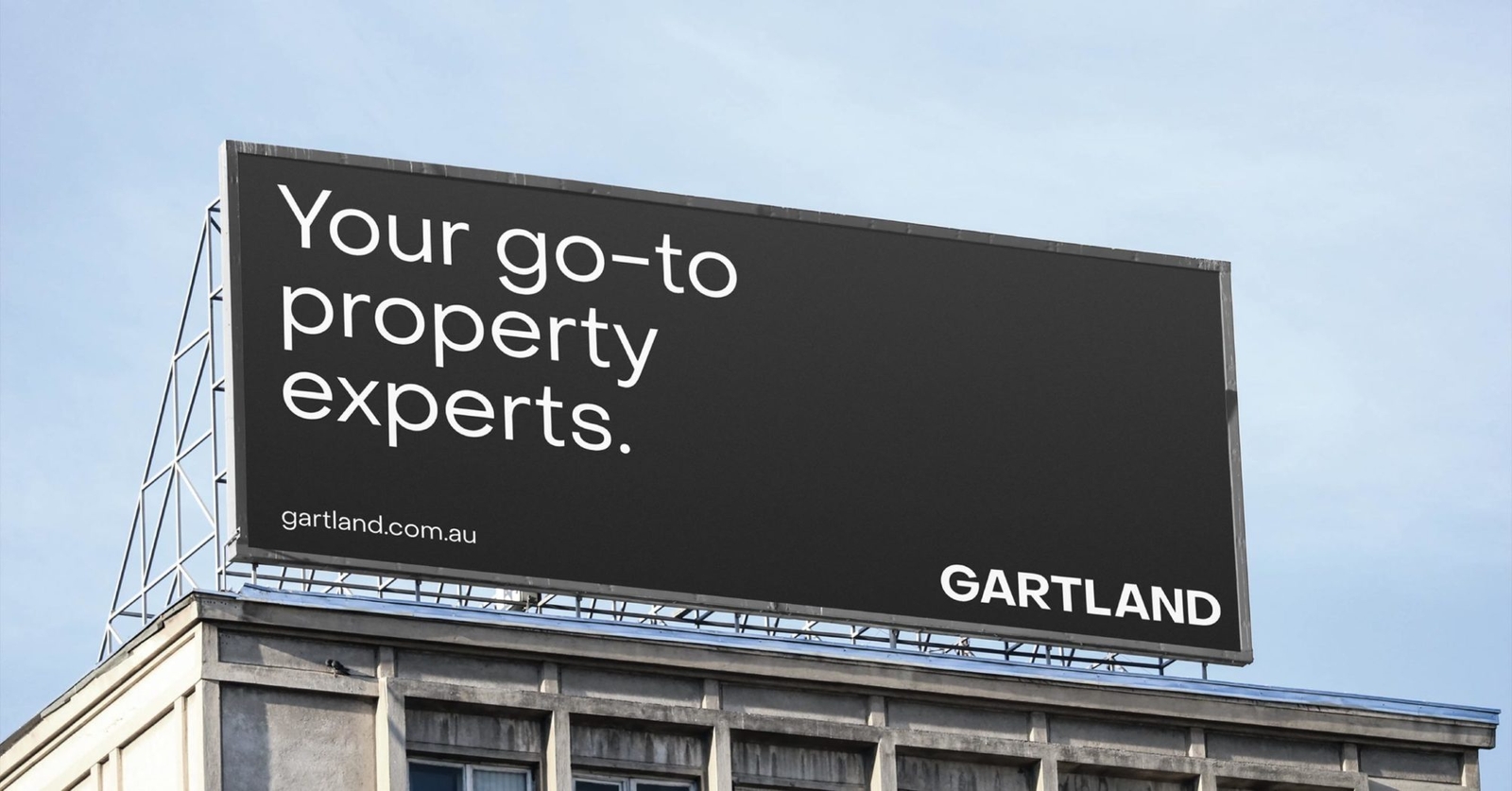
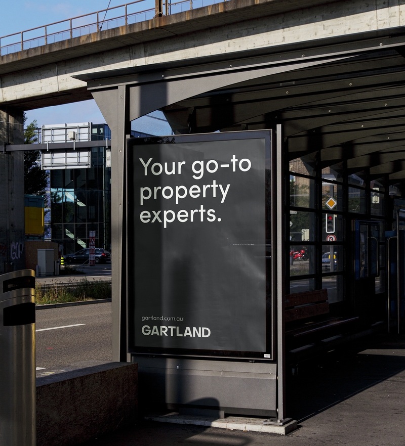
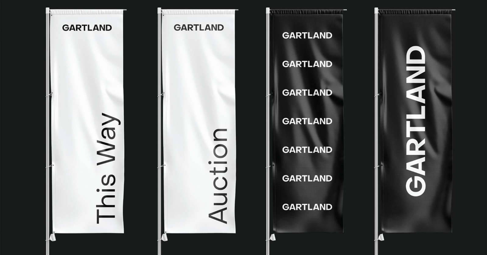
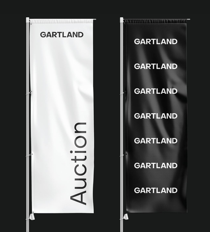
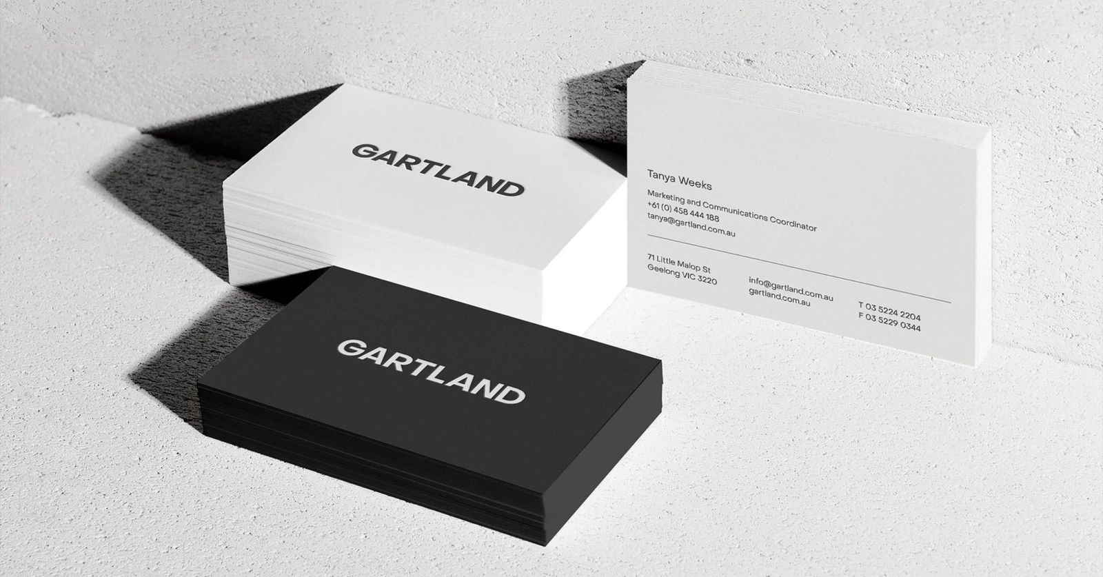
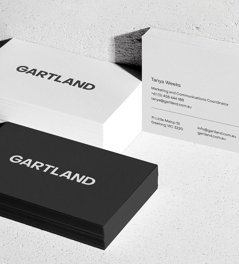
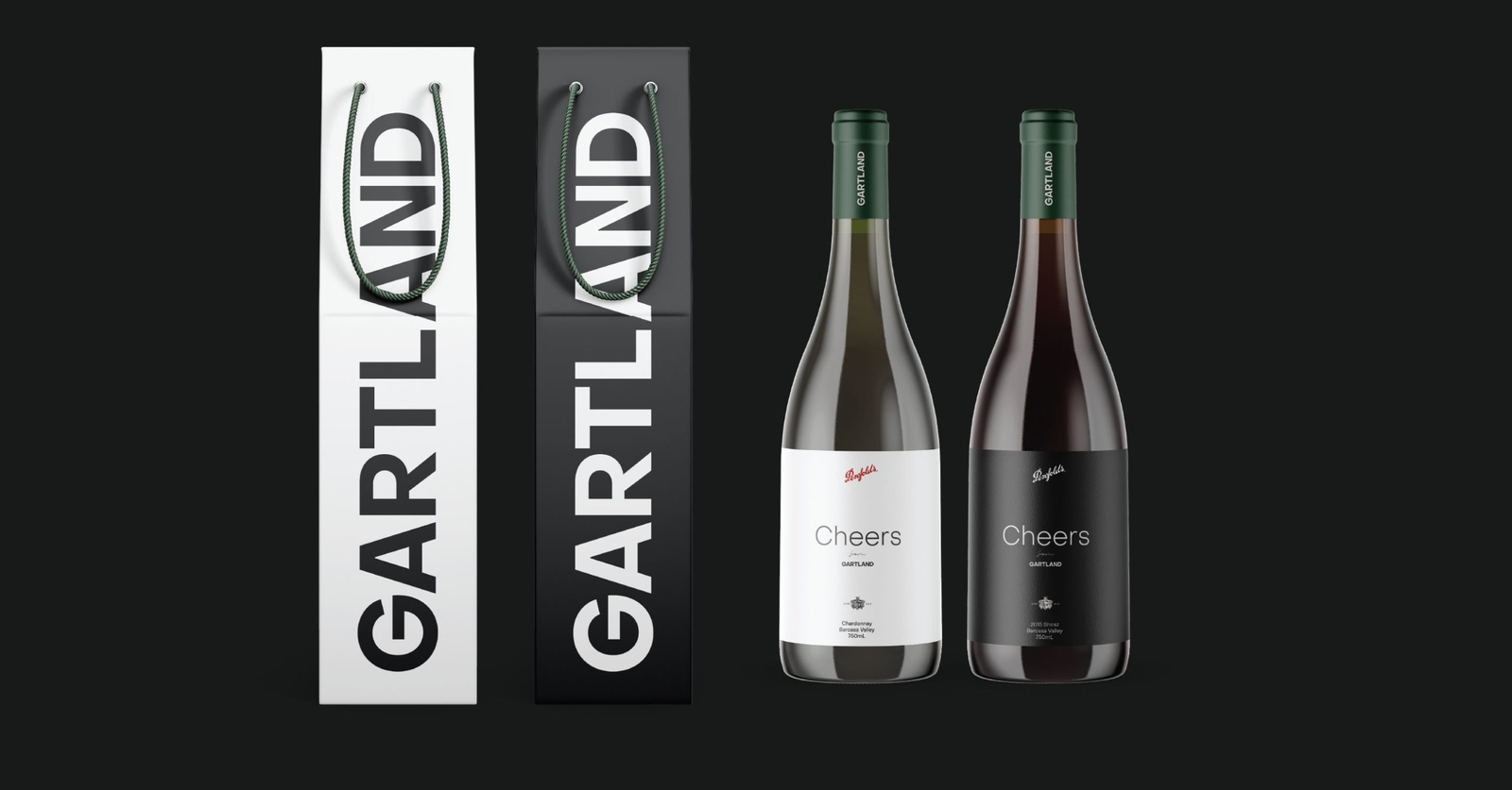
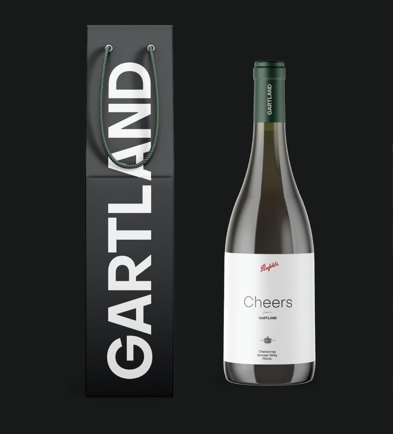
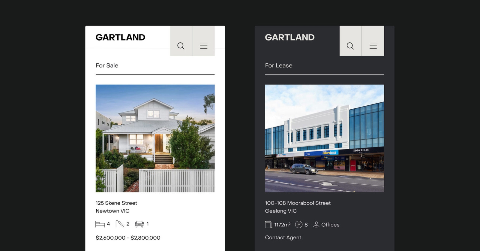
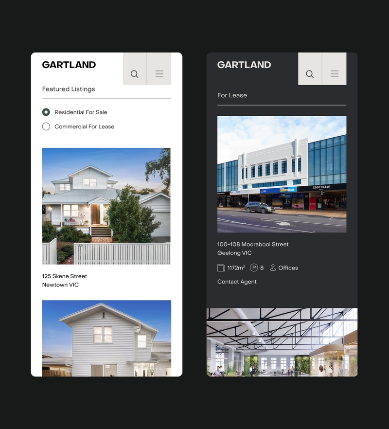
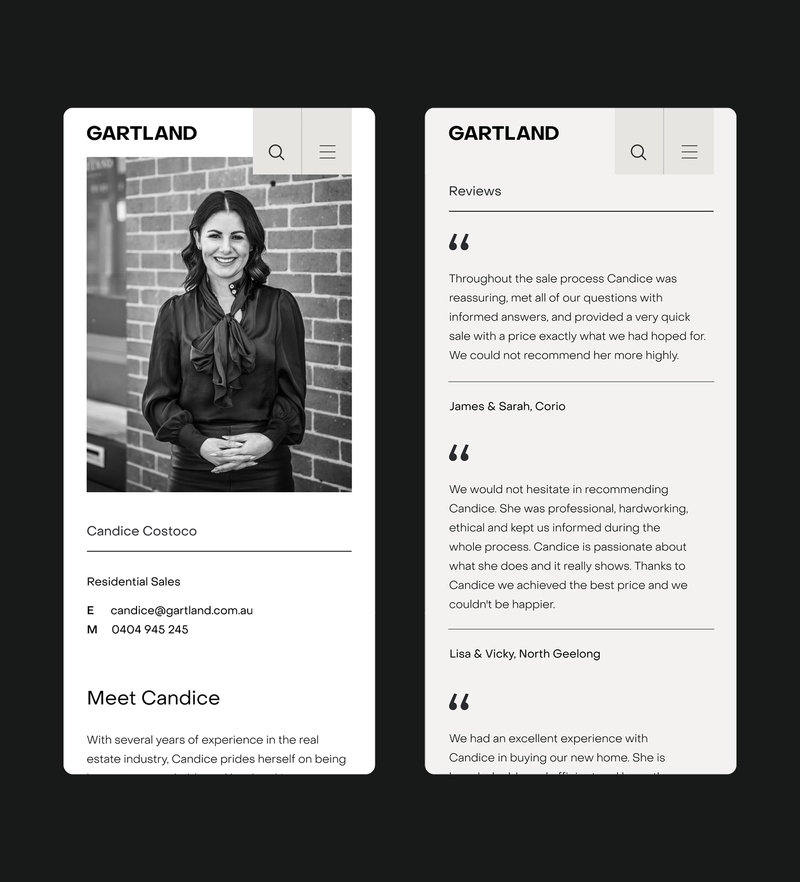
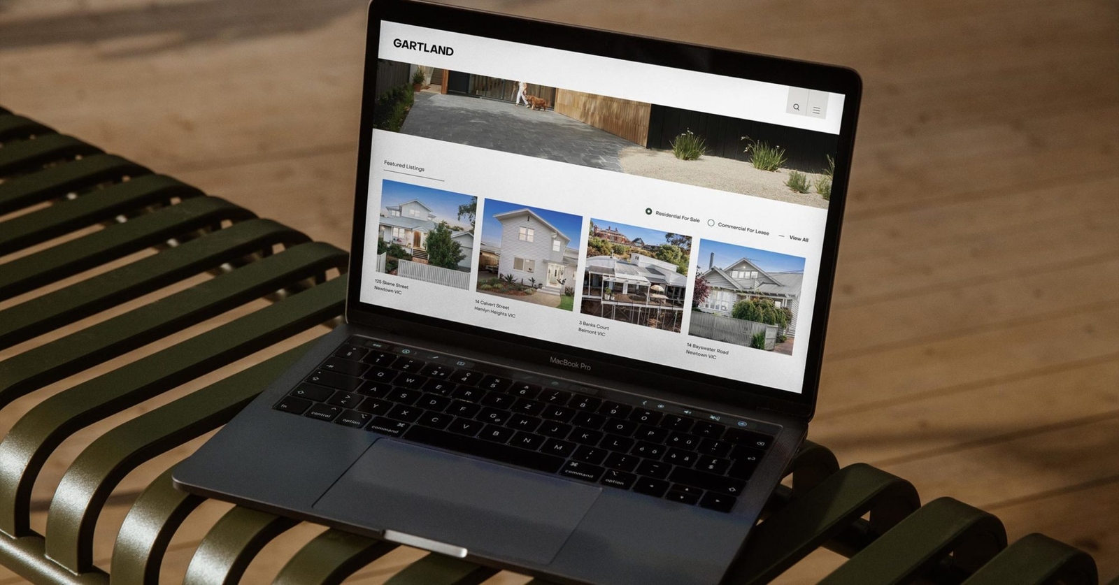
From the outset, we set out to create a brand identity for Gartland that would lift and enhance any kind of property that might need it — from an empty industrial warehouse lease in Breakwater, to the Federation style family home in upmarket Geelong West. In deliberate tones of dark grey for industrial and white for residential, we created a design system that would house both sectors and convey key information with clarity and simplicity. And with a rounder typeface, earth toned secondary colours, and clean, highly minimal layouts, the result is a brand that will stand the test of time and establish trust with a modern, contemporary audience.
Collaborators
- Tanya Weeks
- Michael De Stefano
Team
- Anna Mathews
- Mike Pharaoh
- Tim Meyer
- Nick Thorn
- Tom MB
- Will Pringle
Integrations
- Vaultre
- Inspect Real Estate
- Netlify
- Gatsby
- Wordpress
